Contrast Enhancement and Visualization
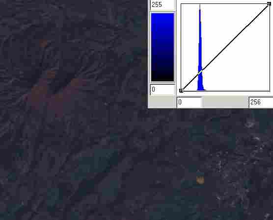
The raw data from the sensor is often not spread over the range of expected responses. This can be due to the distribution of expected returns (very high albedo on clouds and ice, very low in shadows). How do our brains and eyes take raw reflected data and enhances so that we see well? We can do the same digitally.
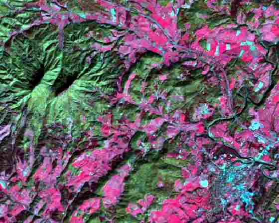
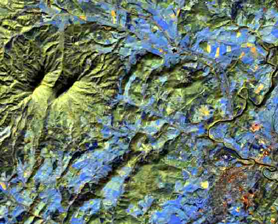
For the scene on the left using the raw data, enhancement would produce the one on the right. The sample histograms (from the blue color display and blue TM band) show the “stretch” applied to increase the contrast in reflectence. This is the “percent clip” routine, here a 99% clip where the histogram is clipped to exclude highest and lowest half percent of the cells and spread the rest out linearly from 0 to 255 (one byte’s worth of values).

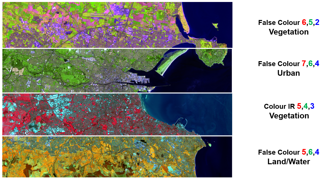
Visualization of geological, soil, vegetative, water, and disturbance features in different environments is facilitated by using other Landsat 7 TM bands in RedGreenBlue display images.
Here are false color (rgb432) and IR-false color (rgb754) images ESRI’s suggestions for Band Combinations for Landsat 8
Notice the ability to discriminate the fields and disturbed areas (one color = turquoise on the left) as two colors on the right (bare field west of lexington is yellow, urban is orange).
Examples of landsat band combinations (landsat 8) Source: https://imgsblog.wordpress.com/2015/10/01/finding-satellite-imagery-for-ireland/
 http://www.geosage.com/highview/features_landsat8.html
Animated view of 336 band combinations (=8x7x6) of a full Landsat-8 scene (using 8 bands)